Design for the thumb
Open your website's analytics and look at one number: the share of visitors on a phone. For most of the businesses we work with in Dubai it is the clear majority. Yet a surprising number of sites are still designed on a wide monitor and squeezed down afterwards. That is backwards.
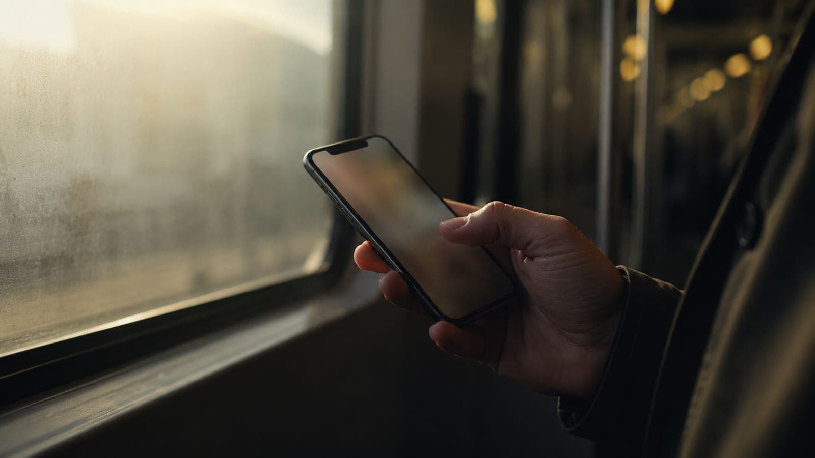
We start on the smallest screen and the least patient moment: someone standing on a metro platform, holding their phone in one hand, deciding in a few seconds whether you are worth their time.
What designing for the thumb means
- The important action sits where a thumb naturally rests, not stranded at the top of a tall page.
- Tap targets are large enough to hit without zooming, with room to breathe around them.
- Text is set to be read at arm's length on a bright street, not admired up close in a design tool.
- The page is light, because a beautiful site that arrives after the bus does is a site nobody saw.
Big screens are the easy part
Once a page works one-handed on a small phone, widening it to a laptop or a large monitor is the pleasant half of the job. Going the other way, starting big and cramming down, is where layouts break and buttons end up buried.
If it works with one thumb on a busy street, it will work anywhere. The reverse is rarely true.
None of this makes the desktop version an afterthought. It makes the phone the proving ground. Pass there first, and every larger screen becomes a chance to add room, not repair damage.